The Blue Opossum
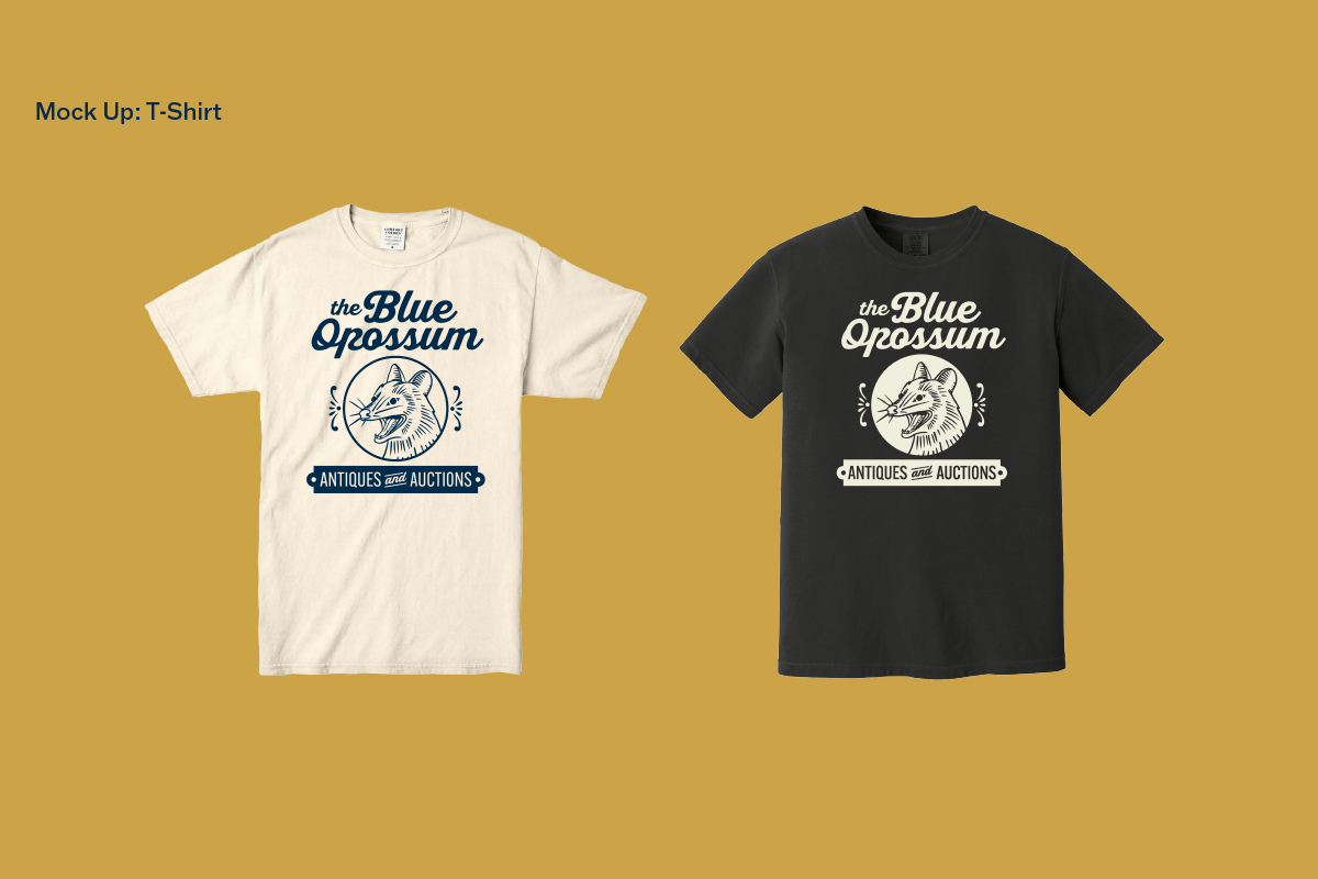
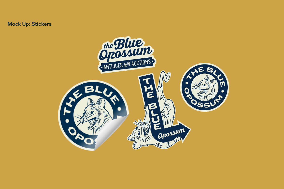
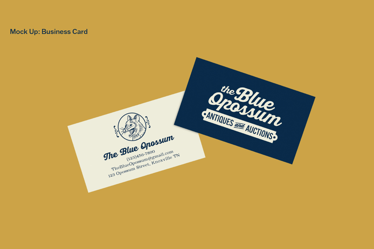
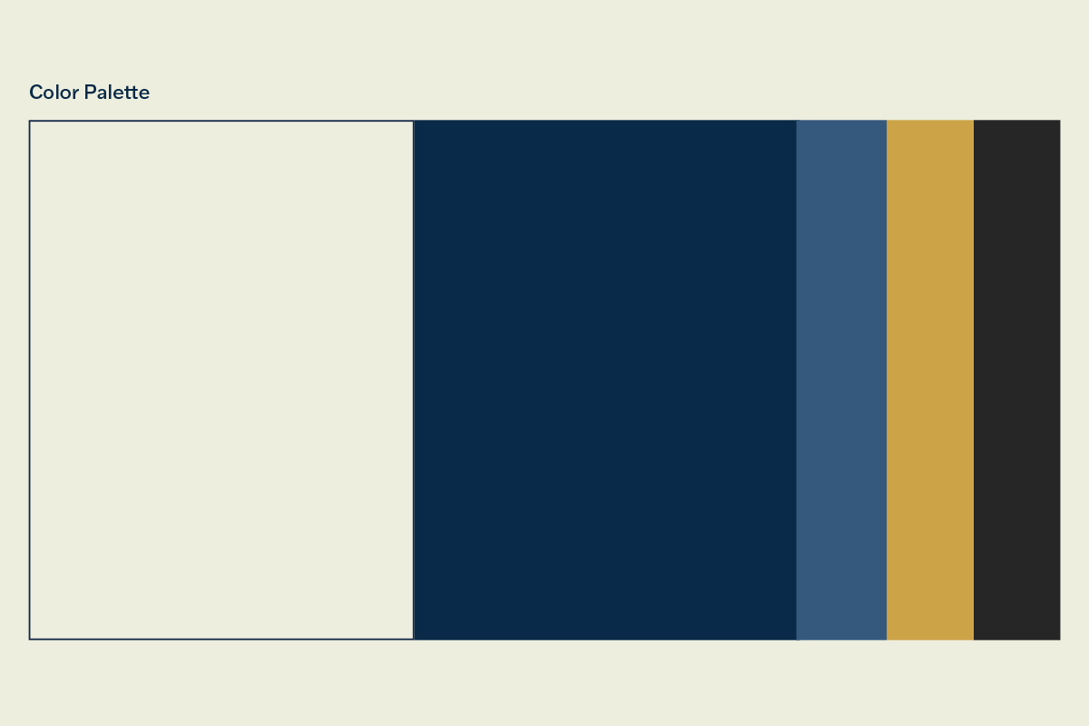
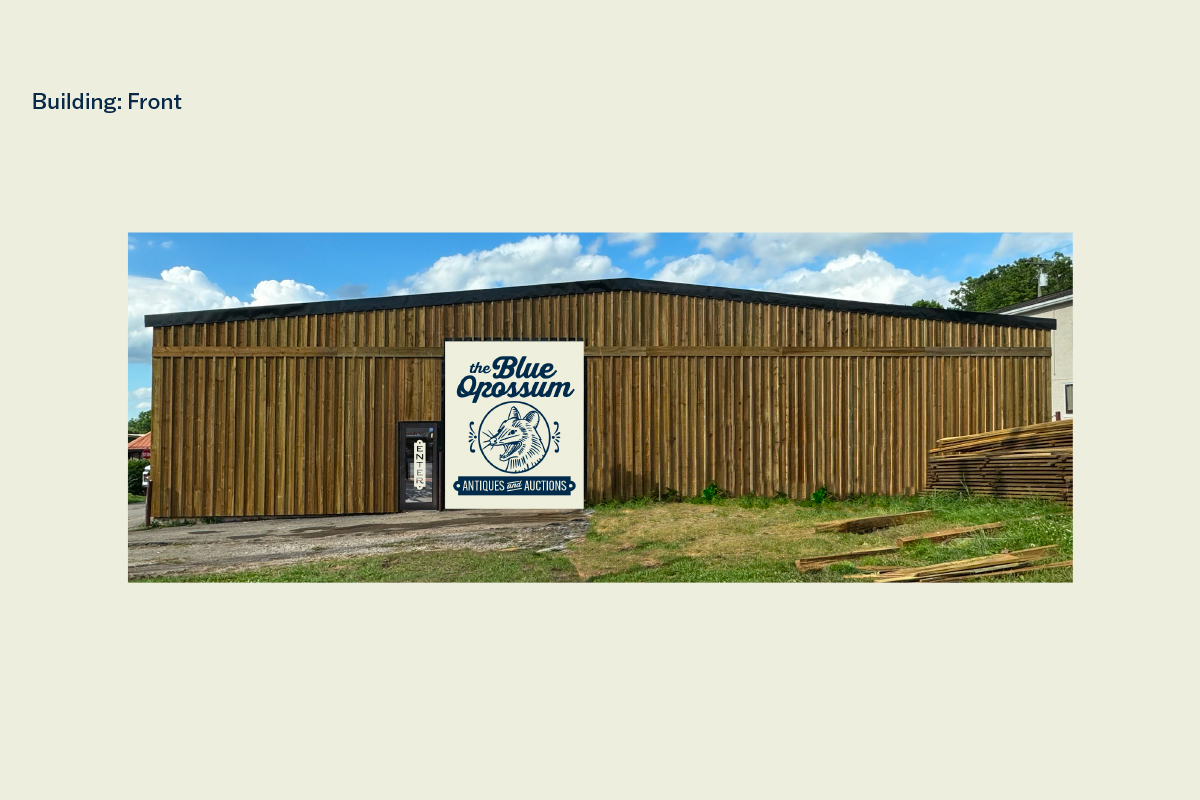
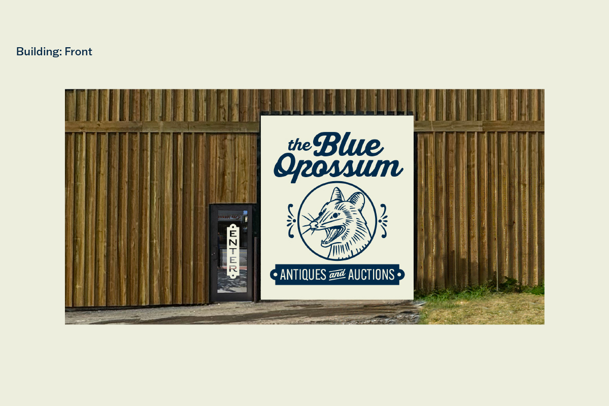
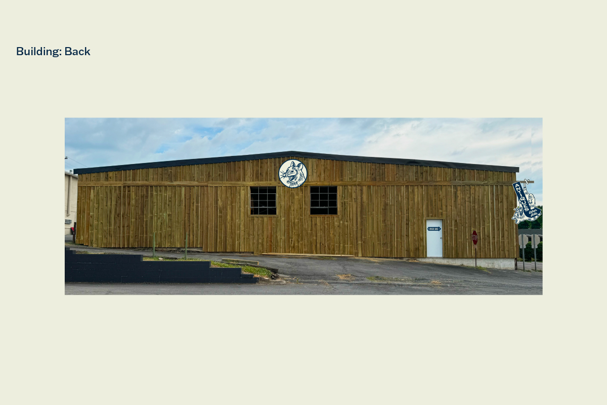
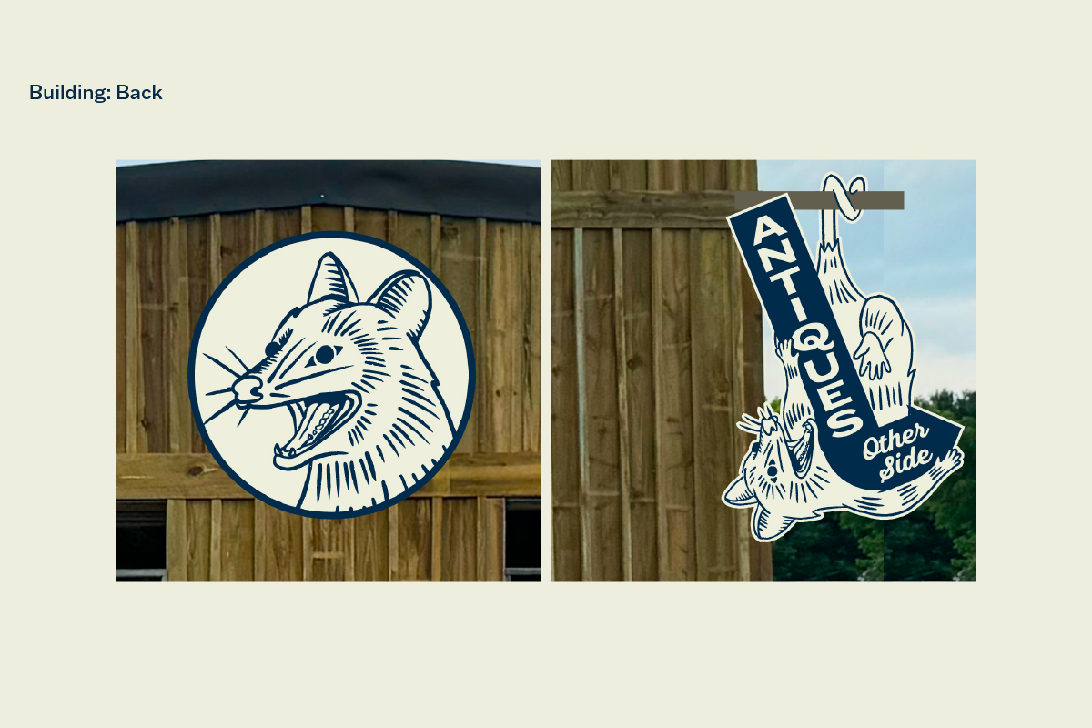
During my internship at Robin Easter, I was tasked with creating a mural for the garage door on an upcoming antique and auction house. This eventually evolved into a unique brand. This project’s constraints were something antique while feeling fresh. After many iterations, I found the perfect style. I used fonts by the American Type Founders for the old feeling and lose lines for the illustrations. The client wanted to have a brand that could have merchandise potential. This led me down a fun route for stickers, signs, and t-shirts full of character. The color palette is muted to emphasize the details in the illustrations. The type system is a little bit more complex as it nods to the wood type letter press. This brand came together in ways I never expected. In the end, my internship did not last long enough for me to present this work, but I feel like it is successful based on my brief.
