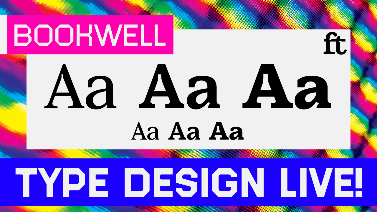
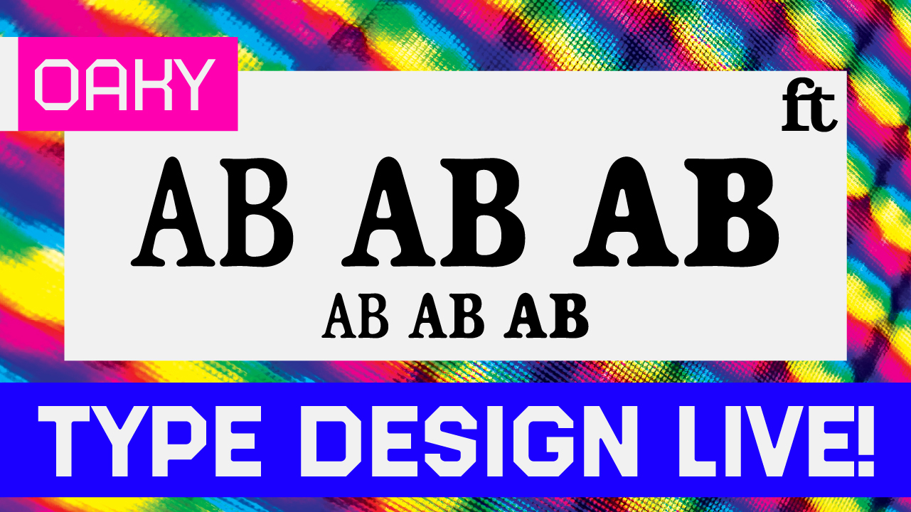
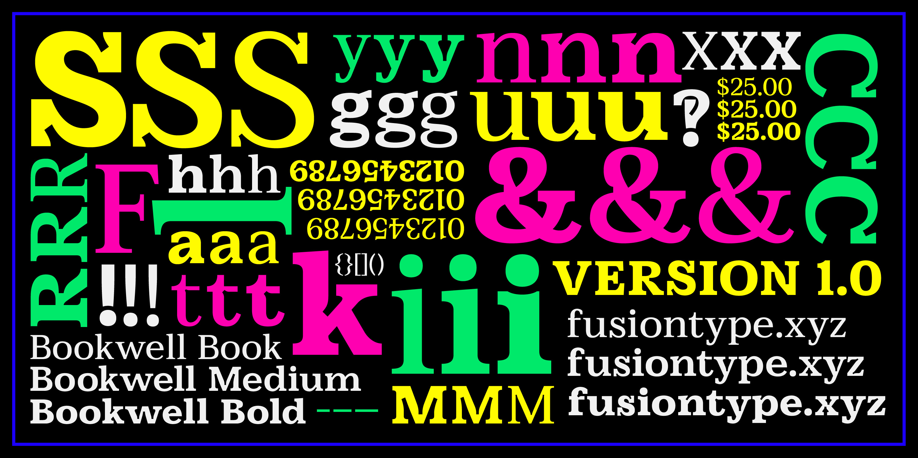
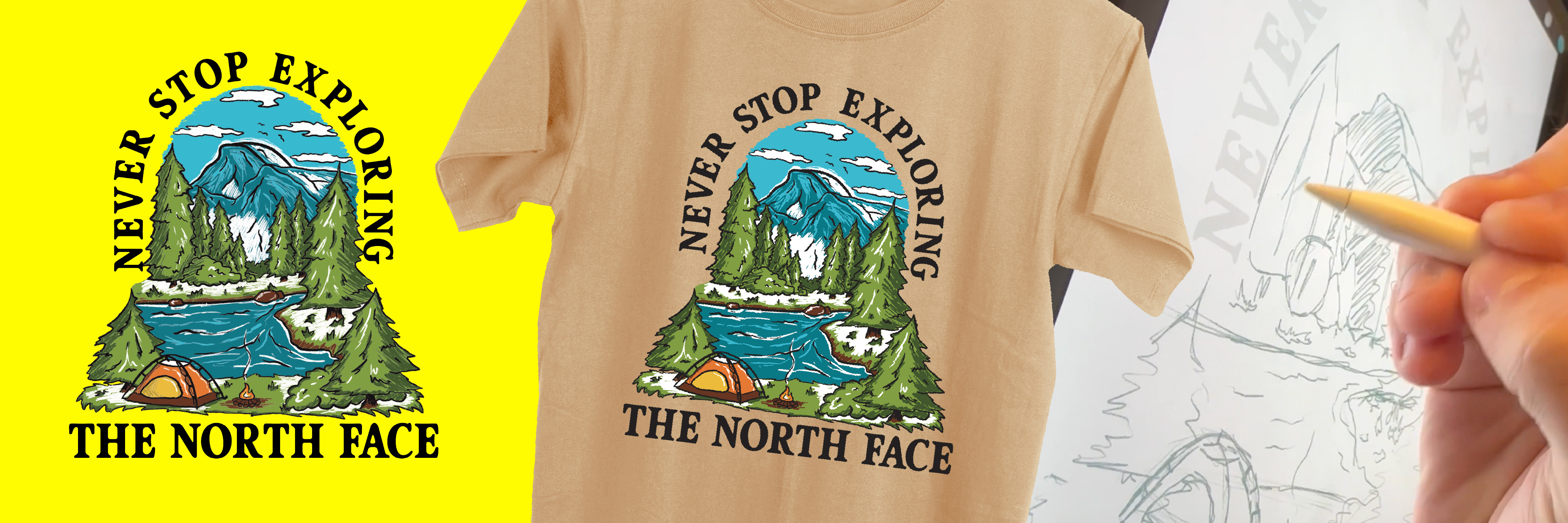
This is the branding that I created for Fusion Type. Fusion Type is my independent type foundry where I release all of my finished works. Going into this project, a brand for myself, I knew what I wanted from the get-go. The branding process was almost entirely based on the website I was coding in tandem to the brand development. I ended up referencing these marquees for a consistent visual element to unite everything. I wanted to use these marquees as they felt like the digital version of old phototype specimen books where they just chop of the overflowing type from the page. This led my visuals to be mostly in motion. I wanted the movement to show off the type as much as possible throughout the site. The logo developed is Bookwell with a sketchy treatment. The sketchiness is a nod to the way I (and many other type designers) like to sketch letters quickly. I wanted the logo to feel clean with a little funk. In the end, I am glad about how it all came together. This allows me to sell my fonts without relying on outside foundries to feature my work. Click on the button to check out the foundry site!
